Saturday, 29 April 2017

Entangled Symposium at Turner Contemporary

I skipped a class at uni to attend this on Thursday.  I went to the exhibition briefly before the talks, but was too rushed and stressed to enjoy it.  I did not get a lot from it.  This puzzled me a bit, but on reflection, I thought it was because the pieces did not seem to relate to each other.  Each piece may have had a narrative, but there was no narrative between them.  I looked at a lot of work from women I had not heard of, and was deeply disappointed that I did not get a Wow factor from them.  I was trying to see what inspired me from new contemporary artists (in line with my recent research, that says find what women are doing now, to inform the feminist concept).  The only 3 that I liked were from established artists - Eva Hesse, Mona Hatoum and Louise Bourgeoise.  Maybe this is why they are so well known. Their work is fantastic.

Courtesy of Katie Taylor

Then I was disappointed that I found the speakers all very esoteric.  I struggled to keep up with listening to complex sentences and making sense of them in my mind, let alone making any notes.

However I enjoyed Freddie Robins conversation piece, and although many of her knitted pieces are not to my taste, I had a lightbulb moment when she was talking about "Bad Mother".  Freddie said she had made it when she had post-natal depression, and her child had taken over her life and seemed to be coming out of her head.  It spoke of the experience of being woman.  A different experience to mine, expressing someone else's reality.

Courtesy of Freddie Robins

Freddie said her work was floppy, which made it easy to transport and store. (This is one of the reasons why I like my samplers - they roll up small and are easy to store).  She also was quite happy for her work to be staged by the curators of a show.  I feel the same - I am not very good at staging and if there is someone more competent than me, I am quite ok with them doing it!  Whereas Maxine Bristow was a complete control freak about staging (I don't get her work at all!).

I met Eliza Gluckman, who is the curator of feminist art at New Hall art collection, at Murray Edwards, Cambridge.  She remembered me from the Whitechapel Gallery Guerrilla Girls event, where I had thanked her for providing some of the funding.  Her comment about that event was that she had felt it was all about looking at the recent past ... with nothing about how to take feminism and women's art forward.  This had not occurred to me.  Eliza is a person to keep an eye on - she does some interesting stuff.

On the way home, I met Freddie at Stratford, while waiting for our respective trains.  I was able to say that I found her the best speaker, simply because what she said was accessible.

Freddie and Eliza made the day worthwhile.


Saturday, 22 April 2017

Draft essay feedback from Linden

I had a telephone tutorial with Linden, giving feedback on my draft essay.  She has a way of getting straight to the heart of the matter.

When I wrote the essay, I found the most difficult part was defining what I meant by Value.  So I wrote the body of the essay first, then a conclusion, then the introduction.  By which time I was very close to total word count.  This meant I did not give enough explanation about what I was considering, or my terminology.  Neither did I relate the quotes to each other.  Linden said the body of the essay was well argued and fluent (where I knew what I was talking about!), but the introduction and conclusion were not.  She homes straight in on the weaker bits.  This is so refreshing and helpful!

Things I need to get into the essay:

I am looking at how values operate in the real world - not in politics, faith etc
Think about Theories. How different theorisers have structured what their theory achieves.
Think about how to introduce theories - "according to ...;  ... discusses/explores
Define how the dictionary definition is unhelpful, how it is contentious as a noun.
State I am looking at issues of value, and further subdivide to issues of gender and value.
Keep referring back to Kohlberg's theory; focus on his research gathering data from men, then applying it to women.

We discussed the need to be precise and concise.  I am over the word count already.  I will try to prune it, but suspect I need to drop a whole paragraph to get anywhere near a low enough word count.

Trip to Contemporary Applied Art Gallery

I was advised by my tutor Simone to look at Emily Jo Gibbs stitched work at CAA.  As I have a new exhibition book, I went along and complied with my rule set - note event and date, make notes on something pertinent, draw something.

Emily Jo Gibbs makes exquisite stitched portraits, sometimes of the person, and sometimes a person represented by their tools.  I was very impressed with her artist statement:

Emily Jo Gibbs
Hand Embroidered Portraits, £1,300 each

After winning an award to create a new body of work in 2005, Emily Jo Gibbs started making hand embroidered drawings of sticks in jam jars, enjoying the quiet beauty of these everyday items.  Gibbs explores the idea of portraits, depicting the person through their workspace and tools: there is a very personal connection between a maker and their tools.  The pincushion is vital if you are working in textiles and they are often beautifully made in tiny needlepoint.  These pincushion portraits celebrate craft and people who make.

CAA member since 2015.
Emily Jo Gibbs, Self Portrait, 2016
(Courtesy of Emily Jo Gibbs)


How great is this!

Thursday, 13 April 2017

Tute with Simone

I found this quite hard.  Simone asked me to talk through my sampler.

She asked me to photocopy the sampler and give a written explanation of what it was all about - I think this was for final assessment.  I had planned to do an artist statement, but feel that if it needs this much explanation, I've rather lost the plot in the working.

I had left in the central tacking line by mistake, but Simone recommended leaving it in.  She queried the colours (purple and green on white - suffragette colours) and why I had chosen blue for the alphabet at the top (a dark enough colour, that I felt was fairly neutral).  She asked who the two stitched figures were (both me, but actually me standing slightly in front of someone who I was representing) and why the quotations were in the same colour as the figure behind.  As a dyslexic, she associated the colour of the script with the colour of the figure, which was not my intention.  I had not thought about making the script the same colour as the person speaking, so agree this could be misleading.  I had copious green thread, and limited purple, so had done the larger amount of stitch in green, and lesser amount in purple, then used the darker colour (purple) for the script when I realised I had enough thread to do it.

Simone advised me to go to CAA to look at a needle cushion.  Possibly by an artist with initials LG.  I looked on their website, and the only work that might involves needle in a cushion is Michael Brennand Wood.  I know his work quite well and it leaves me cold.  I loathe it and I hope I am not expected to be inspired by it.

Simone considered the framework of a sampler, and asked me to think about how to do it differently. Perhaps to work like an undergrad - and experiment with non-traditional ways of working.   I just don't want to do this.  I'm not wanting to work with discordant colour, different scales, ragged edges etc.  She suggested looking at people who worked samplers in a less precise or unconventional way - which I have already done - Tilleke Schwartz.  Except I don't want to work like Tilleke Schwartz.
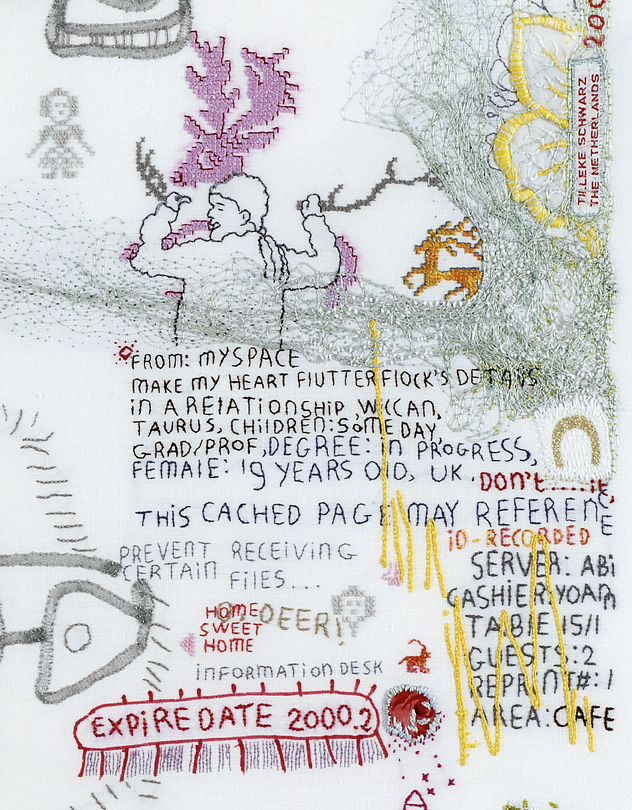
Tilleke Schwartz
She liked the image pushing the boundary, but wondered why it remained within the edge of the hem.  It could have gone to the edge of the fabric, or not been hemmed.  I loathe the idea of a raw edge, and equally feel uncomfortable with the stitched arms of the figure being effectively cut off if wrapped round the edge of the hem.  I think Simone felt it was not a good self portrait as the imagery does not reflect how she sees me ... but this is irrelevant to me ... it's a self portrait, so it's about how I see me, not others.  I think she felt I was working, clearly within a boundary, so the term pushing a boundary was inappropriate.   But the way I see it, is that although the imagery I have used is about things I have done that have pushed my boundaries, in the greater scheme of things, it's small beer.  I went to Australia to study, having never lived abroad before, and took on a different style of education.  But it was fully supported by another university, I did not study abroad in a country where I would need to speak a foreign language, and I had my husband with me.  Compared to incoming students at London Met and Herts, and political migrants in general, what I did, although it pushed my boundaries, was minor.

Simone wanted me to work onto tracing paper before I started the next sampler.  More radicalness of pushing boundaries.  More 'what if' questions.

I suppose what I am trying to do, is portray women in a way that changes the narrative from the patriarchal male imaginary, to my definition of the female imaginary.  I'm using the traditional format of stitch and the sampler to juxtapose different female imaginaries.


Russian Revolution at Royal Academy

I was very tired when I went to this exhibition.  I wanted to think about how politics affects how people are represented.

The first room was painted red - quite a political statement.  Communist ideals originally required artists to make art fora everyday life - to be interpreted by a widely illiterate audience.  At first this artwork was innovative - film, photos, graphic arts - and applied arts: ceramics and textiles.  With the new politics, old floral textile print blocks (from Paris) were destroyed as too bourgeoise, and new repeat patterns like red spinner and Five years in Four were created to fit with the Monumental Propaganda.

Red Spinner fabric, Golubev 1932
I felt the exhibition should have included a clear definition of the word Propaganda.  It comes from the verb To Propagate - i.e. to multiply by division.  It is not necessarily Governmental or corrupt!

Hammer and sickle flag was meant to indicate industry and agriculture were equal in Russian Society - except it was not - industry was valued hugely higher.  Images of Shock Workers - showed muscular leviathans who promoted strength of Russian Industry, when actually many people were killed in industrial accidents.  Food was rationed by a hierarchy system - half a loaf a day for 'workers', a quarter of a loaf for domestic people, and one sixteenth for dependents!

There was much diverse work for avant grade artists at first but soon the diktat was for art to be representational and fit the Government agenda of the Socialist Realism style.

As usual all the stuff that I liked, was not available in postcard format.