Sunday, 2 October 2016

Guerrilla Girls at the Whitechapel Gallery.

What a wonderful day out with my friend, Lisa!


Guerrilla Girls poster outside the Whitechapel Gallery
(and over the station sign to my beloved Aldgate East station, where I was the Duty Station Manager!).
Yesterday I went to their exhibition and talk "Is it even worse in Europe?".  There was a one room exhibition which was very much in the style of Conceptual Art, Art & Language Group, where the meaning does not lie with the material object but with the theoretical argument underpinning it.  The theorising is the primary activity for these artists, not a subsidiary to it.

The Guerrilla Girls had sent a thought provoking, if slightly aggressive, questionnaire to 383 museums/ Kunsthalles in Europe.  (I had to ask what Kunsthalle meant, and it is an art space that does not have a collection, but exhibits work that they do not own - like Whitechapel Gallery).  101 responded, 282 did not (c1/4 responded).  The 101 responders were listed on the wall; the 282 who did not were listed on the floor!

I need to go back and photograph the questionnaire as it raised a lot of questions in my mind.  How did they select the respondents? (I thought there must be more art galleries in Europe).   How did they compile the questions? The questions must have been carefully constructed, but were they meant to intimidate (leading to a risk of non-response); to enable a respectful answer; to provoke the museum to start some self-analysis; or to lure in for annihilation?  The GG had collated the responses into a book, which were secured to a desk in the room.  They had also used copies of all the answers to paper a wall, over which were placed GG posters of key responses -

Your first time running stats on diversity (some museums admitted this was their first time!)
Even better in Poland (Polish museums show more women artists, give more honorarium payments to exhibitors, and have more women in charge)
Female trouble (only 2 museums exhibited more than 40% women artists, 21% have fewer than 20%)
Where in the World is Whitechapel (13% of solo shows from people from outside Europe and US)
Genderosity (78% non-gender conforming artists at Witte de With, lowest at Guggenheim, 30 did not answer)
Complaints (But 40% of our team are women!, your questionnaire does not enable non-English punctuation to be included (fair comment!), US centric bias)
So Sorry (Not able to answer your questions)
US Museum practices polluting Europe (No - Guggenheim; Yes, let's fight; Such as … parallel gun shooting?; No selfie stick)
What Keeps Museum Directors up at night (funding).

One of the quotes was:

"The Guerrilla Girls focus on the understory, the subtext, the overlooked and the downright unfair.  Art cannot be reduced to the small number of artists who have won a popularity contest among the big time dealers, curators and collectors.  Unless museums and kunsthalles show art as diverse as the cultures they claim to represent, they are not showing the history of art, they are just preserving the history of Wealth and Power!"

The GGs are running a 5 day event at Tate - this will be worth going to next week.

I tried to take notes of the lecture, but struggled to keep up.  There were 2 gorillas, Frida and Kathe Kollewitz.  They have 55 gorilla members, diverse women by race and orientation, successful artists and unrecognised ones.  All voices required.  GGs were agitating outsiders, who are now insiders!

When GGs started, they analysed collections and noted Renaissance and Ancient Greek treated women and men artworks equally (either all nude, or all clothed, except for Baby Jesus who was the only naked, full frontal man, depending on the period), but it was in the 19th/20th century when women were depicted nude and men were clothed.  In the 1980s it was always the same minority artists who were shown.  Tokenism became the solution.  GGs became part of the establishment - shock, horror - in art history lectures - what to do?  They chose to participate - still attacking.  They discovered works of female artists were usually in the basement.  Underneath the men.  So they put women on top!  They also noted when Victorian museums have names around the portico, they are all male - why not put women's names up?

Key point I need to consider - "if you can make someone who disagrees with you, laugh, you have a hook inside their brain.

GGs Activity Book.  GGs Facebook pace.  GGs Hysterical Herstory of Hysteria.  Feminism is a cure for hysteria?

The GGs shows their brand new video manifesto.  Brilliant.  Look it up on Youtube.

Claim a stereotype to disarm it.  This is why they use Guerrilla name/ Gorilla masks, and the term Girls.

They now get positive media attention, not lunatics in gorilla masks.

Fantastic day out. I was too slow to gain maximum benefit.

The hands of a creative person - my friend Lisa

Sunday, 25 September 2016

Reading around Nancy Spero

I am going to try taking notes using quotations, as recommended my previous tutor, Linden Reilly.  (I am still somewhat hacked off that my university, London Met, have made her redundant, while her course, MA By Project, is still running!).

Otherworlds, The art of Nancy Spero and Kiki Smith edited by Jon Bird.  Reaktion Books, London 2003.

Essay - Imagining Otherworlds: Connection and Difference in the Art of Nancy Spero and Kiki Smith, Jon Bird p13-45

"Otherworlds .. with all the connotations of the relations between self and other, the difference that is gender, the feminisation of the body that is the (m)other, and the contradictory promise of the redemptive aesthetic  … for our sense of embodiment.

"Feminist critics and art historians have been asking … how the social and historical circumstances of gender might be integral to deciphering the patterns of meaning of subjectivity and art making. … Art is made out of the narratives of individual histories and experiences formed from and against the cross currents of culture.

"Spero's experiences as a 'first generation' post war Americal feminist artist … were the visible and public expressions of the exclusion and alienation experienced by most women artists during the 19602 and 70s.  Spero developed a power metaphorical visual language combining word and image.

"The body is symbolically and psychically invested with lived experience, significant beyond our everyday engagement with the world of things.  … Bodies, specifically the female body, are the semantic units of the visual language of Nancy Spero … a language whose grammar is drawn from the characters of mythology, scripture, history and the contemporary world. … Her works include the carfnivalesque inversion of the codes and regulations of social normality … and encounters with alterity as a reframing of the self.  … Spero's mapping of the figure, from an emphasis upon the odd in pain (victimage) to the dance as a symbolic image of freedom and choice.

"There is a shifting aesthetic value of the decorative and the unstable boundaries of high and low art.  The ideologically binding aesthetic values to issues of gender is traced in Andrewas Huyssen's mapping of the gendering of mass culture as feminine since the late 19th century:

the political, psychological, and aesthetic discourse around the turn of the century consistently and obsessively genders mass culture and the masses as feminine, while high culture, whether traditional or modern, clearly remains the privileged realm of male activities.

"Even, into the late 1970s, the decorative could still be judged an interference or distraction in the critical artwork of some feminist artists.

"There are two rival aesthetic models - the engineer the machine, the functional and the reductive and which is implicitly coded as masculine; the other stresses the body, fashion, and the dance, all of which carry the cultural connotations of the feminine.  The initial tendency of critics and historians was to recognise the equal validity of craft-based and decorative forms and practices, recognised as feminine. … Now the decorative is seen as always intruding a subversive presence within the modern, unravelling its myths of progress, autonomy, masculinity and order.

"Colour has consistently been placed on the side of the decorative, subordinated to the power of line to define structure and form.

Nancy Spero, Marduk, 1986.  I like her use of script and line drawings.

Monday, 19 September 2016

City Lit class- Inspired by Nancy Spero - Female Archetypes.

Last Monday I started this 4 week class at the City Lit.  It promises to be excellent. Nancy Spero was an artist from the US who was prolific in the 1960s and 70s and whose work was feminist and controversial, often using violent themes and ancient female forms to comment on 20th century female issues.  She was inspired by ancient female forms from a variety of historical periods and used their gestures and body language to create contemporary imagery.

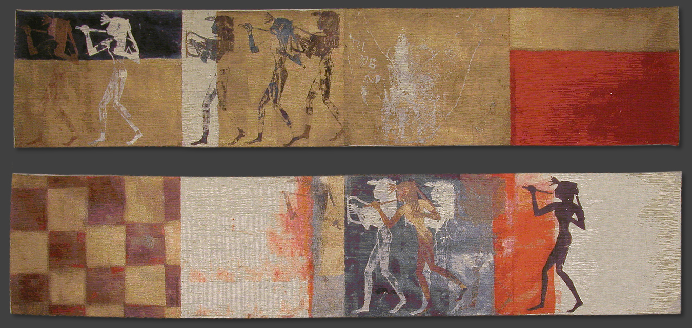
Nancy Spero. Energetic Moving Women.

The class has 8 women participants - culturally diverse but all appear to be well educated, middle aged women.  The tutor, Heidi Wigmore, will be great, I think.  She comes across as a very knowledgeable, feminist, art teacher, whose work focusses on the figure.  She is an approachable feminist, and very encouraging - the last seminar I did had a very angry feminist who put me off this sort of event, but I think Heidi makes a good contrast.

Nancy Spero.  Repeated prints and bold colour.
We started last Monday with a fantastic trip to the British Museum to draw ancient female artefacts.  I find it difficult to use museums in this way on my own, but as part of a group, it was a much easier experience.  I drew using a pen and a graphite stick, as I know museums prefer non-messy media.  I was quite astonished when one group member immediately started using open bottles of coloured ink in a free, dribbly style.  Quite soon a Museum Customer Services person came up and requested this be put away.  The artworks were very lovely, but had great potential for mess.  Other people were using charcoal, which gave lovely effects, especially when viewed the following week, as facing pages had transfer printed, giving depth and body to the drawing.

The class is designed to cover:

- The meaning of female archetypes in historical, contemporary and cultural contexts.
- Visual research of examples of female figures in the British Museum collection eg. Goddess representations in various cultures including Ancient Greek, Egyptian, Asian
- The objectification of the female figure in contemporary media as part of consumer culture 
- Dynamic drawing techniques to create 'expressive' figures
- Experimental mixed media approaches to making original imagery eg collage, mono-printing, photocopying, tracing, carbon copying etc
- Using a projector to enlarge and compose drawings to make a 'drawing installation'
- Composition and juxtaposition of found images and hand-rendered images to create meaningful personal narratives.
This week we brought in contemporary images of women, and used them to create carbon copy tracings, juxtaposing, repeating, mirror imaging etc.  We were encouraged to trace images, but using our own style and gestures so the imagery became our own.  It was amazing how the images different people had chosen, and the way each person interpreted the Spero inspirations, made each artist's work different and identifiable.

Our drawings will be used in a later class to compile a multiple image on a frieze.  We were advised to use several drawings of a repeated image.  Repetition enables a message to be read.  Don't use too many different images.  Keep it simple.

It was a great class.
Nancy Spero, Sky Goddess protecting the women.

Saturday, 10 September 2016

Maggi Hambling - Touch - works on paper at British Museum.

I went to the Maggi Hambling exhibition as soon as it opened.  I was not sure what I made of her work prior to looking closely.  All the works were black & white, obviously by the same hand, but with significant variation of effect.  Some of the artwork descriptions gave comments that I as a student could do well to remember when I am working!

I started looking at a drawing of a stuffed rhinoceros from her early years … "just discovered ink as a drawing medium - risky, no correcting".  Then a reclining nude …"did not set out to use collage, but … necessary … to simplify".  "…to touch the subject with all the desire of a lover".

Energetic and gestural.  Gestural marks convey different emotions  soft, sensitive wispy - compassion (when drawing a very old tutor of hers, when visiting in hospital right at the end of his life).  Uplifted chin, listening to and conducting unheard music. (Cedric).  Is the energy of the gesture about the artist or the subject?  Artist statement adds narrative.

Portraits done in charcoal, mono print and monotype.  I have had to look up the difference between monotype and mono print although there is a fluidity in the use of the terms.  Monotype is where the plate is inked, paper laid, then drawn on - as done by Tracey Emin.  Monoprint is where the plate is inked, drawn, paper laid and pressed, or the plate is drawn, paper laid, and pressed.

Lots of different effects in the Wall of Water monotypes.  Beryl reclining - shows speed is of the essence - uses her hands to manipulate the ink.  Excellent range of effects.  Stephen falling asleep triptych was bold, gestural ink.  Death sketchbooks drawn in pencil, show sensitive images of both her mother and father when very close to death.

Maggi Hambling, Wall of Water
Courtesy of British Museum
Absolutely wonderful.  Only one room of drawings, right at the top of the British Museum, but small enough to spend serious time looking at them.  Ace.


Friday, 9 September 2016

Exhibitions in Scotland

While on holiday in Scotland, I went to a selection of exhibitions/museums/National Trust venues.

House for an Art Lover, Glasgow  This is a house, built in 1990, from plans designed by Charles Rennie Mackintosh in c 1906 for a competition.  It meant he was unfettered by a client's wishes and designed to his wildest flights of fancy.  It was an amazing house.  At the start of the 19th century, most architects were focussed on Greek, Roman or Gothic Paris, and sex was taboo.  He was working with modern materials, Japonism, imagery and symbolism.  His symbolism was about growth, rebirth and the feminine form, moving radically away from Victorian woman repression.  Women were starting to become political although they had limited opportunity in public.  CRM was fusing meaning and reality.

The modern builders of the House for an Art Lover have worked in detail to create interiors from the plans - but they are interpretations not rigid copies.  As usual they are ambiguous designs which can be read as the awakening of the maiden, and to my mind look like they were designed by a woman desperate for a baby (Margaret MacDonald).

I particularly liked the drawing room - designed for ladies to withdraw to after dinner, which was circular, white, and meant to be feminine.  It felt wonderful.

Ladies drawing room, House for an Art Lover

Hill House, Helensburgh  I have been here several times, but each time, the house has evolved slightly, showing more interpretation of the interior.  This time I noted the variation in colour of the column of glass lights in the door leading from the family areas of the house, the hall, into the servants area which led to the kitchen.  This leaded light was were mostly purple, with one green panel, which subtly denoted it led from family to servant area.  Very subtle, but a clear indicator once you understood the code.

Another architectural detail was the difference between rooms designed for the 5 children of the family and their parents.  The children's rooms faced east to gain the early morning light, symbolic of early life, and the parents rooms faced west for the evening light, indicating the waning of life.  Great symbolism.

When in the bedroom, there was all sorts of sexual symbolism, once you knew the symbols.  On the settee, there were stylised thistle seed heads - indicative of fertility.

Thistle seed heads scarcely visible behind the white table
in the Hill House main bedroom
"Reason informed by emotion - expressed in beauty - elevated by earnestness - lightened by humour - that is the ideal that should guide all artists"  CRM.

Tenement House, Buccleugh Street, Glasgow  This was a turn of the century tenement house, which was lived in by Miss Agnes Toward (1886-1975) from 1902 to 1975.  It was a middle class tenement, 1st floor.  She worked for a shipping agent, office work - not manual work, and she and her mother were members of the Church of Scotland.  She moved there with her mother, and continued to live there alone after her mother's death.  Miss Toward hoarded trivia so many postcards, theatre programmes and other ephemera indicating her interests were present when the flat was vacated.  It was a rented property and was furnished with her grandparents furniture, so she had few outgoings, which presumably meant she was able to travel and enjoy a social life.  She worked until the age of 73 (for social contact?) as a spinster, with no family.  She lived in the tenement until the age of 80, then spent a further 10 years in hospital (dementia?) until her death.  She kept the flat and paid the rent to the end, so it was a detailed, undisturbed, archive of her life.  The tenement was set up as it would have been in her lifetime, including the range, and box bed, in the kitchen, deal table and jars of jam she had made!

Kitchen of Tenement House

Hunterian Art Gallery, Glasgow  This has the Mackintosh House which was the last Glasgow residence of Charles Rennie Mackintosh and Margaret Macdonald before they moved away from Scotland.  I drew one of Margaret Macdonald's banners for the Scottish section of the international Exhibition of Modern Decorative Art in Turin, 1902, 15" x 20'.  I also looked at her metalwork fire screen panel 1899.  My opinion is that this shows her desire for a child.  They married in 1900, when she was in her mid 30s - late marriage for the era.  They never had children.  They had one nephew, Sylvan, who inherited their estate and who gifted it to Glasgow University in 1947 when he emigrated to South Africa.

Margaret Macdonald, 1899, metalwork firescreen
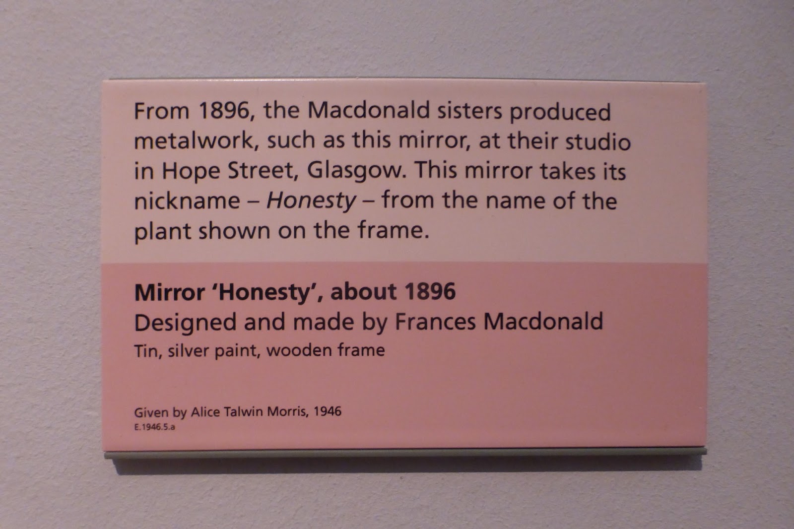
Additonally I looked at Margaret Macdonald's mirror surround, Honesty.  I am thinking about personal values as part of my inspiration, and honesty is something I identify with, and feel strongly about.  I was thinking about how to represent it as a concept in my stitch work - and the plant as used by MM is inspirational!


Charles Rennie Mackintosh was engaged to his employer's sister, Jessie Keppie, prior to settling down with Margaret Macdonald. Was this mirror made around the time of the change of relationship?  Perhaps I am reading too much into it, but it would typical of their symbolism that a plant in a design should be used to make a significant comment!

Glasgow School of Art Walking Tour

I have done this tour several times since the fire at the GSA meant the tour could not be inside the building, and it changes every time - yippee!

"The Art School taught me to look at the world and see that there is art in the mundane and obvious, as well as in the exotic"  Peter Capaldi (b1958 graduated GSA 1980)

Willow Tea Rooms is being refurbished as CRM heritage centre for 2018 in the name of Miss Catherine Cranston's Tearoom.  (Willow Tea Rooms is a copyrighted name and is being kept by the current owner.  I think the new branding promotes a Victorian woman as an innovative business woman and fits with 21st century agenda to celebrate the achievements of diverse people).

Glasgow buildings can be approximately dated from the materials.  Blonde sandstone was 19th C and red sandstone was 20th C (when the blonde sandstone quarry ran out!).  GSA designed for 14,000 GBP : the east wing alone ran to 42,000 GBP partly due to blonde sandstone being used when it was in short supply 1906-14.  West wing done 1914-16, also in blonde sandstone.

Lots of red sandstone buildings by other architects using greek, roman and continental design features carved into the facade - none of which was my taste.

Mackintosh style became increasingly simplified.  But increasingly ambiguous.  CRM was never a member of the Glasgow Art Club (men only), but associated with the Glasgow Society of Lady Artists.  He redesigned their premises ( which backed on to the GAC) and even put an oval design over their front door!  Symbolic of femaleness or what?!  He associated the oval with the feminine.

Doorway to Society of Lady Artists
Much of CRM design is ambiguous.  His round window design for a door at the Glasgow School of Art, of grass and seed head, can equally be read as a pregnant stomach with a swollen bosom.  I like it whichever way it is read.  It could be male, female, or about nature, growth, and the cycle of life.  I can't find an online image of it, although I have a postcard from GA.

Facing the World, Self Portraits Rembrandt to Ai WeiWei.  Scottish National Portrait Gallery, Edinburgh

Great exhibition.  Key ones I liked:

James Nasmyth - back of hand as portrait.
Angela Palmer - brain of the artist.  16 sheets of glass engraved with brain images from scan.
Frits Klemm had reduced his self portrait to a line for his head and shoulders, surmounted on a heavily textured painters table.
Samuel Van Hoogstraten had painted a serious of object associated wit thin.

Analysis shows men and women represent themselves fairly respectably and play on their positive attributes in a self portrait.  However, when men include women in self/group portraits the woman is often portrayed unflatteringly - prostitute, sexualised, or less in some way to the men/man.

The Weavers Cottage  This was a small NT property, that demonstrated what a traditional weaver's cottage was like.  I had an interesting conversation with the lady hand weaving on a 200 year old loom.  She was obviously a bit of a feminist (yippee!) as she had made sure her name was associated with the tartan fabrics she made to commission for various NT purposes.    The building also had a chest of drawers full of old tartan samples … including ours!

Hand woven tartan samples

Our MacTaggart tartan

Tuesday, 9 August 2016

Georgia O'Keeffe at Tate Modern

Great show.  A complete history of a prolific artist.  She observed early on in her career, that a lot of her work, while teaching, was designed to pleased 'whoever', but she had made nothing to please herself.  Then a friend sent a portfolio of her work to art dealer Steiglitz, and her career took off.  They worked together (him a photographer and art dealer, her an artist) for 6 years, until he secured a divorce from his first wife, and then they married.  He must have been about 25 years older than her.

The exhibition started with her charcoal drawings, then moved on to synasthesia and chromasthesia.  She moved from water colours (associated with women and amateur status) to oils (male media and professional), but there was also work in pastel.  O'Keeffe referred to Dow's quotation "the essence of composition is to fill the space in a beautiful way".  To my mind, a better definition is "to use the space in a meaningful way".

 O'Keeffe was adamant that her work was not feminine, as usually described by critics.  The exhibition implied that her work was labelled feminine after nude portraits of her by Steiglitz showing voluptuous curves.  Critics gave her an imposed identity by describing her landscapes in terms usually reserved for nude art, which she fought against for the rest of her life.

Work shown moved from architecture (farms and New York), landscape of autumnal North East farms and arid desert in south west USA; flowers; fruit; bones and skulls; representations of weather.

Lots of postcards, demonstrating the breadth of her work.

An excellent show.

Sunday, 7 August 2016

Back from Holiday - Conceptual Art at Tate and Nancy Spero art class at City Lit

Jim and I had a month cycling in France, and have come back refreshed for me to get back to my student role.

While we were away I was thinking about the differences between values and status.  I have been thinking about values, regarding a self portrait, and have found it difficult to identify why other people would value me.  My ideas about valuing people is all about how people are observed to behave and whether it connects to my ideas of what is worthwhile.  However, in the media, I think people who are the focus of attention are often depicted because of their status.  I have been reading a little about status.

Status can be ascribed or achieved.  Ascribed status is defined by things that cannot be changed; what we are born with - gender, race, colour, orientation(?), disability etc.  So does this fit with the equality agenda, with which I am familiar? Achieved status is defined by things that are achieved by own effort - marital status, education and qualifications, ownership of possessions (house, car, money).  This interests me.

I have also had a day at the Conceptual Art exhibition at Tate Britain.  I found it moderately interesting while I was there, but at often happens, it exercised my mind more afterwards.  It focussed on Conceptual Art from 1964-79 (largely Labour Governments during this time), and reflected on how art is a trigger for social engagement (i.e. right up my street).  At the beginning of this period the Art & Language Group were playing around with the idea that meaning does not lie with the material object, but with the theoretical argument underpinning it.  Theorising is not subsidiary to art, but a primary activity for artists.  This suits how I operate - my artwork is what I do when thinking about a concept, in order to make sense of it.  Then in the mid 1970s the role of Conceptual Art was to re-engage with the wider world - to have a constructive or polemic purpose in society.  My art is about enabling the practical contributions of people in a diversity of roles to be recognised and valued.  I think this can be defined as 'constructive".

Courtesy of  Tate Britain

Next I was running around the City Lit website, and found an art class I wanted to do. Focussing on Nancy Spero - Female Archetypes.  Four Mondays, 10-1315 from 10 September 2016.  Nancy Spero was a feminist artist from the 1960s to 2009 who focussed on the female form, violence, and war, and who was influence by Greek friezes, and worked in collage and print (partly due to disabling arthritis), used script and interesting use of space.  The course specification stated attendees would need an A5 concertina sketchbook available from Cass Art.  I love things that are either long and narrow, or wide and shallow, and this really appealed to me.

"Masha Bruskina / Gestapo Victim," 1994
Handprinting and printed collage on paper, 19 x 26 inches. Photo by David Reynolds.
© Nancy Spero, courtesy the artist and Galerie Lelong, New York
I have been reading around Nancy Spero and her art, and find her works very inspiring, although often not to my taste.  However, with my analysis of my own situation with ascribed and achieved status, and linking this with value systems from my own family, I think I could produce a very interesting sketchbook.  

Nancy Spero, "The Hours of the Night II," 2001. Handprinting and printed collage on paper, 11 panels approximately 9 x 22 feet overall.

Nancy Spero, Notes in Time, 1979

Add into this, what I have learned at the Conceptual Art exhibition about the use of language and script, and my own focus on value and status of women, and I have some interesting ingredients to put into a class.  I bought 2 sketchbooks and am tempted to do one sketchbook in my own time during August on how I see my status, and another one in class about how others see my value.  I think the Value sketchbook is much harder, as it requires input from others, and I don't want it to be narcissistic - it needs some discomfort (rather than flattery) for me to be able to do the self-portrait.   Using one of the quotes from the Conceptual Art exhibition, 'When an artist uses a conceptual form of art, it means that all of the planning and decisions are made beforehand and the execution is a perfunctory affair.  The idea becomes a machine that make the art.'